Matplotlib可视化
Contents
|
|
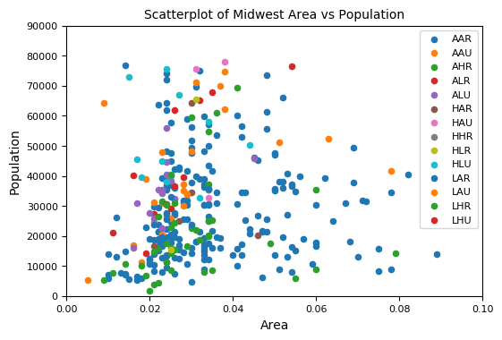
散点图
|
|
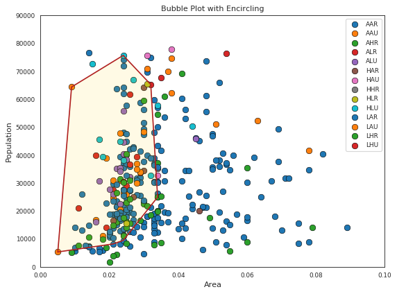
带边界的气泡图(Bubble plot with Encircling)
|
|
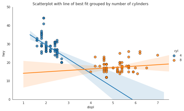
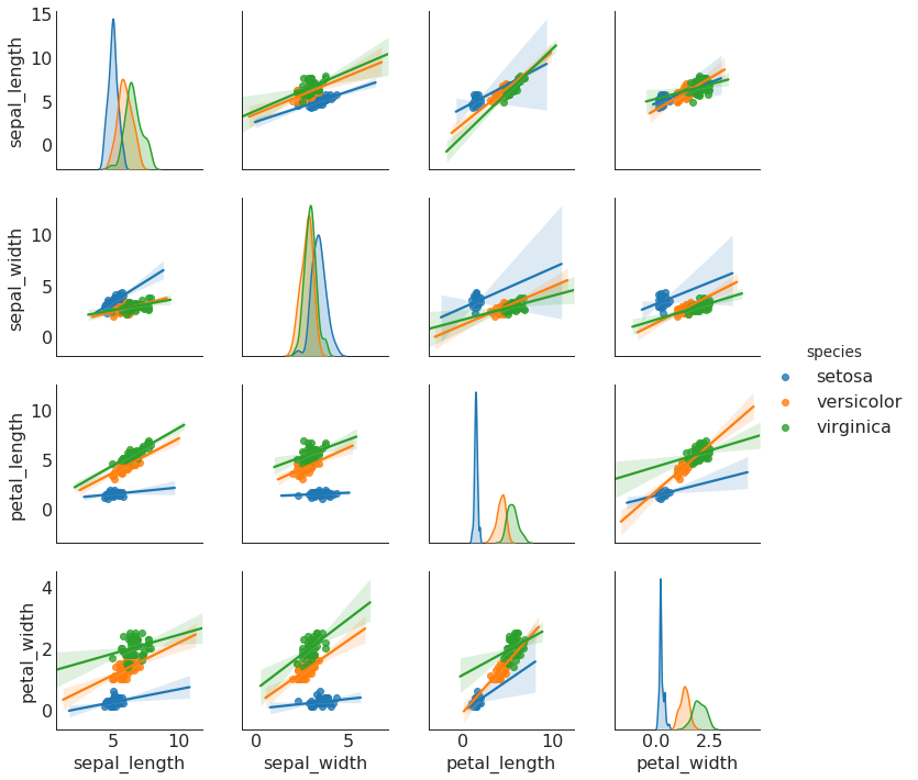
带线性回归最佳拟合线的散点图 (Scatter plot with linear regression line of best fit)
要禁用分组并仅为整个数据集绘制一条最佳拟合线,请从下面的sns.lmplot()调用中删除hue =‘cyl’参数。
|
|
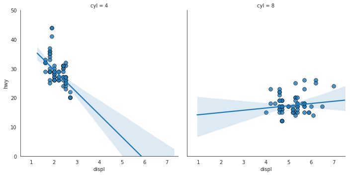
针对每列绘制线性回归线
|
|
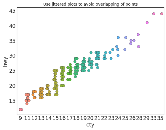
抖动图 (Jittering with stripplot)
|
|
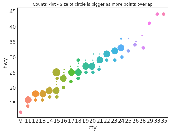
计数图 (Counts Plot)
|
|
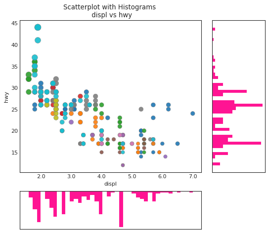
边缘直方图 (Marginal Histogram)
|
|
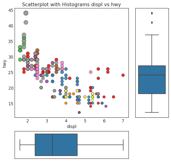
边缘箱形图 (Marginal Boxplot)
|
|
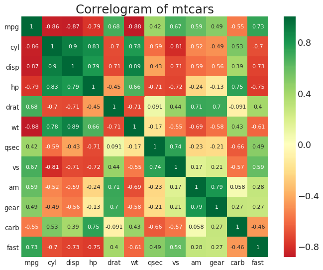
相关图 (Correllogram)
|
|
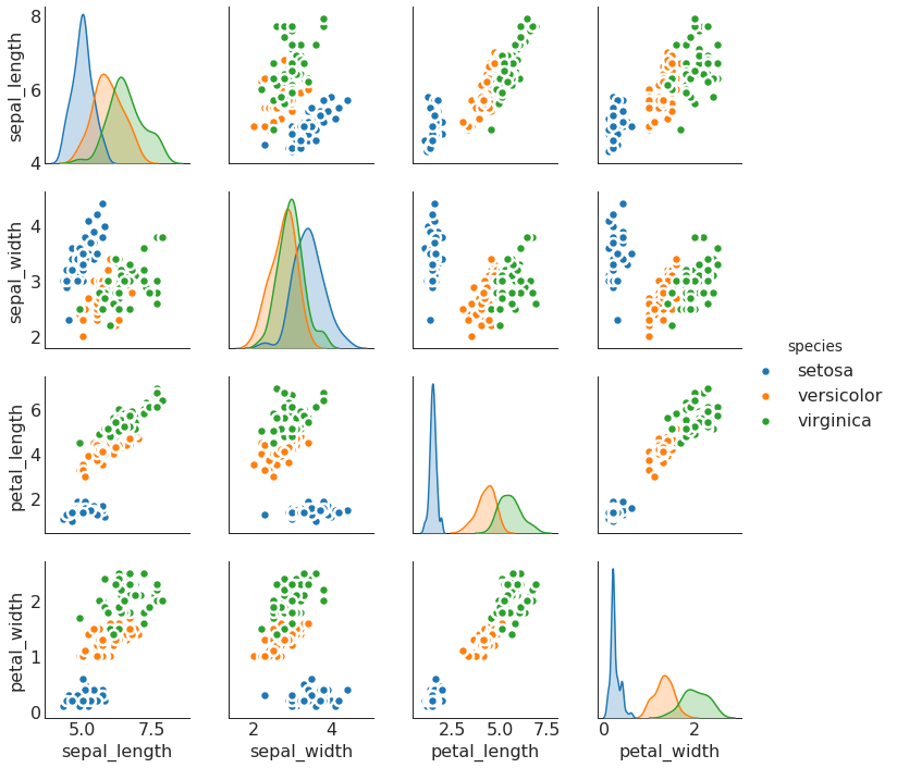
矩阵图 (Pairwise Plot)
|
|
|
|
偏差 (Deviation)
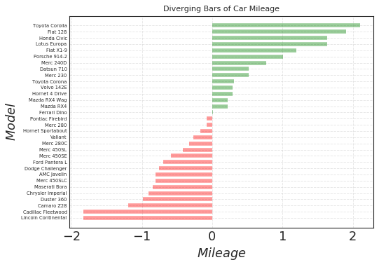
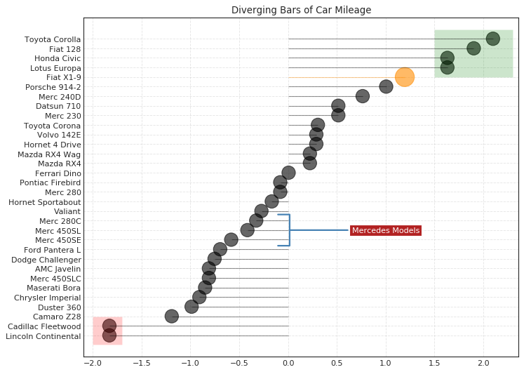
发散型条形图 (Diverging Bars)
|
|
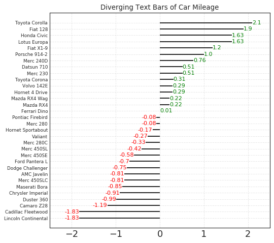
发散型文本 (Diverging Texts)
|
|
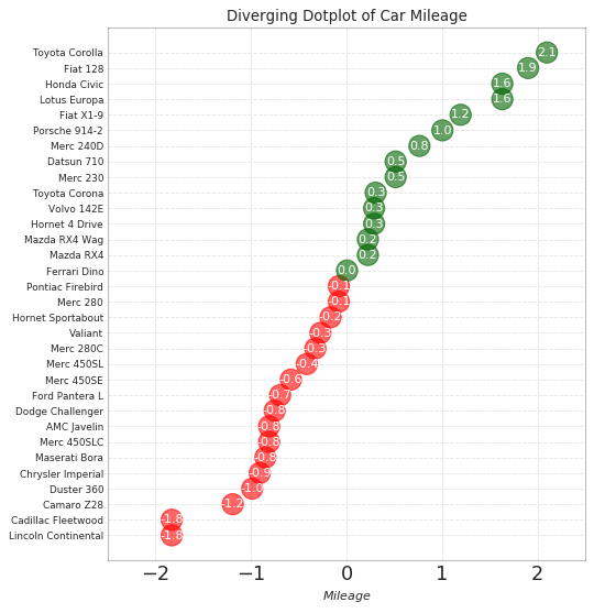
发散型包点图 (Diverging Dot Plot)
|
|
带标记的发散型棒棒糖图 (Diverging Lollipop Chart with Markers)
|
|
面积图 (Area Chart)
|
|
排序 (Ranking)
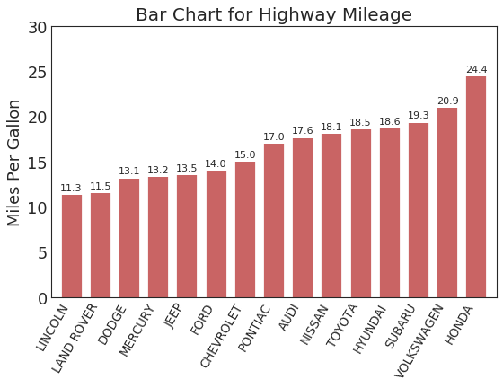
有序条形图 (Ordered Bar Chart)
|
|
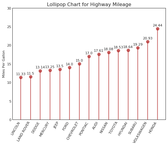
棒棒糖图 (Lollipop Chart)
|
|
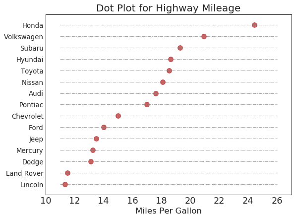
包点图 (Dot Plot)
|
|
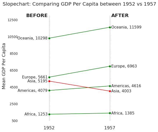
坡度图 (Slope Chart)
|
|
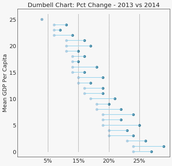
哑铃图 (Dumbbell Plot)
|
|
分布 (Distribution)
连续变量的直方图 (Histogram for Continuous Variable)
|
|
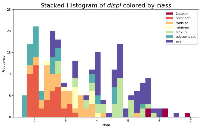
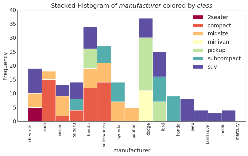
类型变量的直方图 (Histogram for Categorical Variable)
|
|
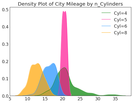
密度图 (Density Plot)
|
|
直方密度线图 (Density Curves with Histogram)
|
|

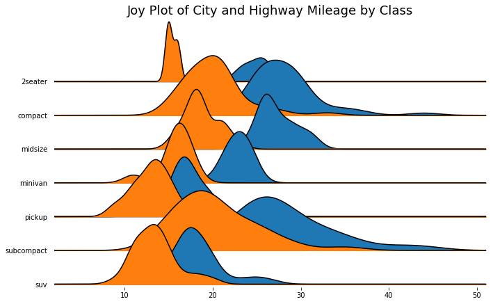
Joy Plot
Joy Plot允许不同组的密度曲线重叠,这是一种可视化大量分组数据的彼此关系分布的好方法
|
|
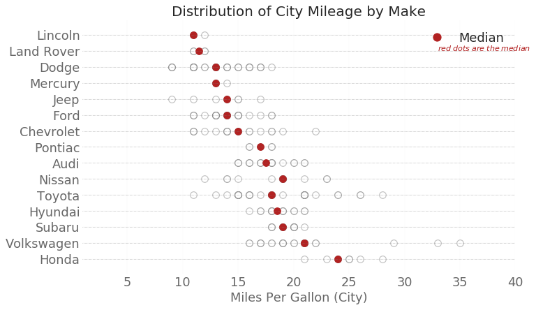
分布式包点图 (Distributed Dot Plot)
|
|
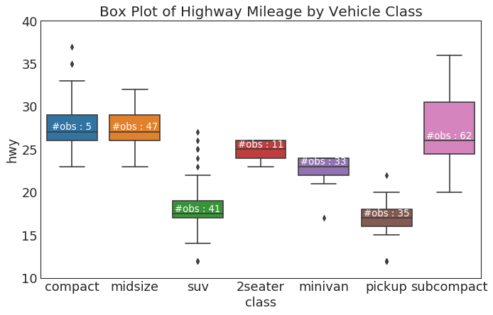
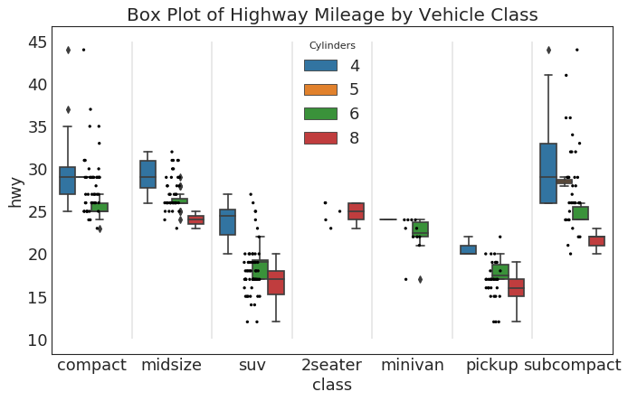
箱形图 (Box Plot)
箱形图是一种可视化分布的好方法,记住中位数、第25个第45个四分位数和异常值。 但是,您需要注意解释可能会扭曲该组中包含的点数的框的大小。 因此,手动提供每个框中的观察数量可以帮助克服这个缺点。
|
|
包点+箱形图 (Dot + Box Plot)
|
|
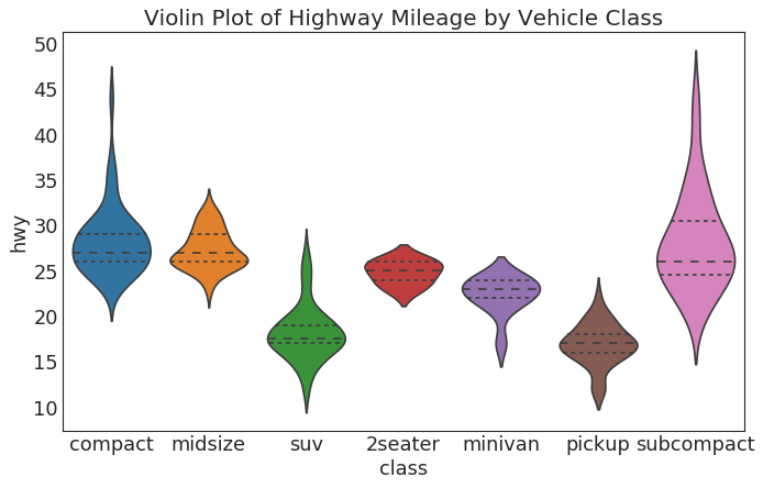
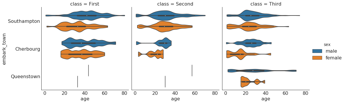
小提琴图 (Violin Plot)
|
|
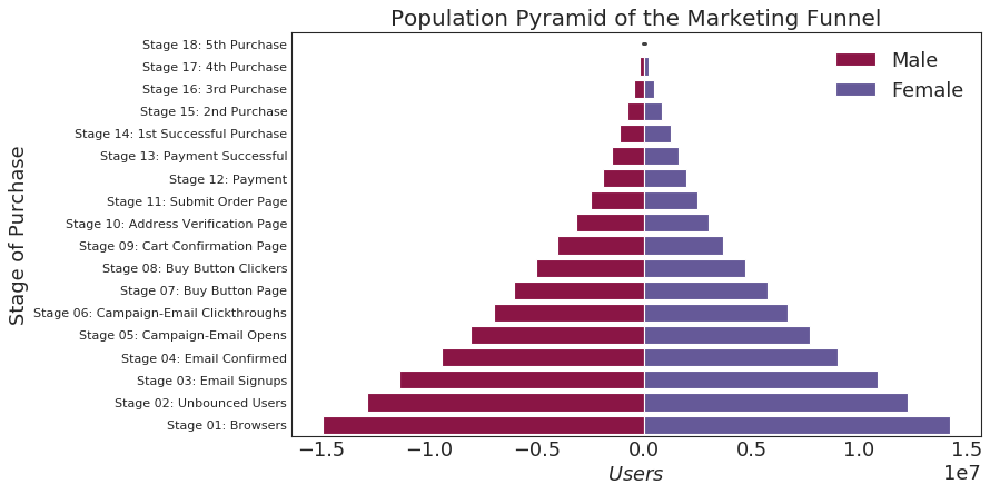
人口金字塔 (Population Pyramid)
|
|
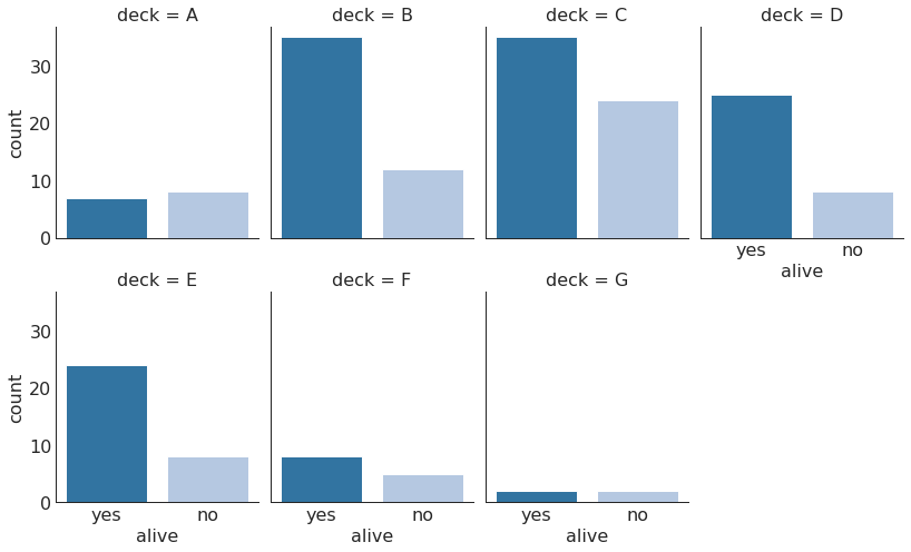
分类图 (Categorical Plots)
|
|
|
|
组成 (Composition)
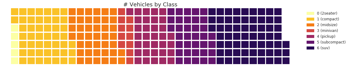
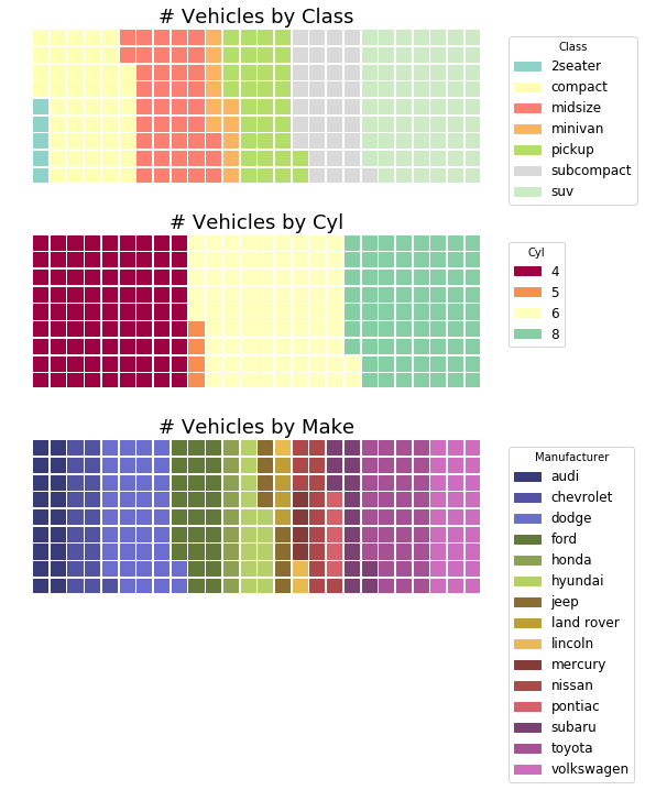
华夫饼图 (Waffle Chart)
|
|
|
|
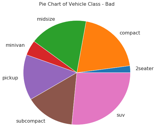
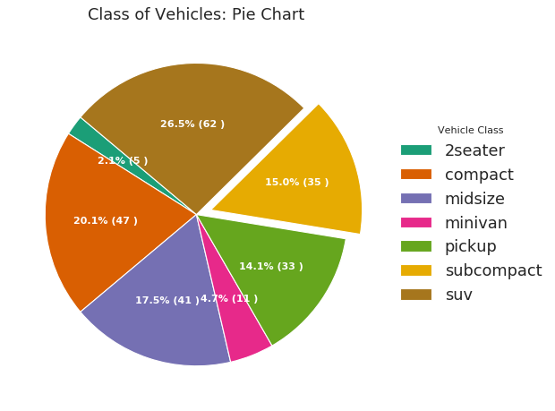
饼图 (Pie Chart)
|
|
|
|
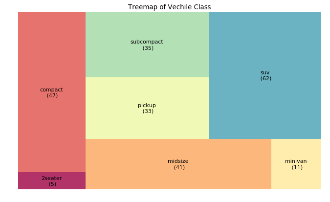
树形图 (Treemap)
|
|
条形图 (Bar Chart)
|
|

变化 (Change)
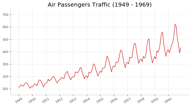
时间序列图 (Time Series Plot)
|
|
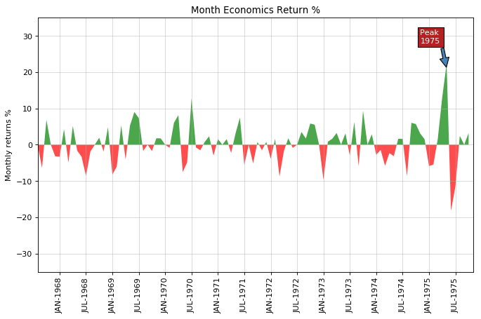
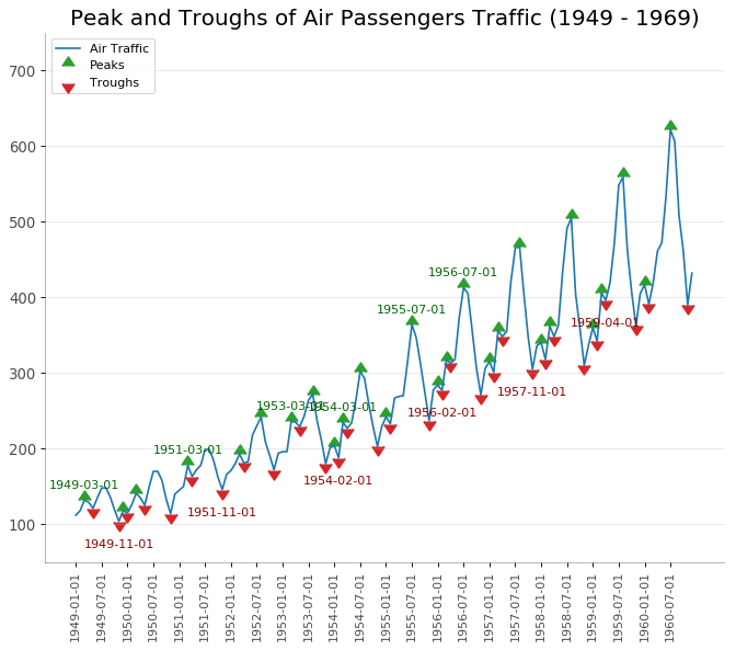
带波峰波谷标记的时序图 (Time Series with Peaks and Troughs Annotated)
|
|
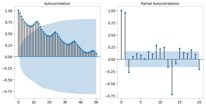
自相关和部分自相关图 (Autocorrelation (ACF) and Partial Autocorrelation (PACF) Plot)
|
|
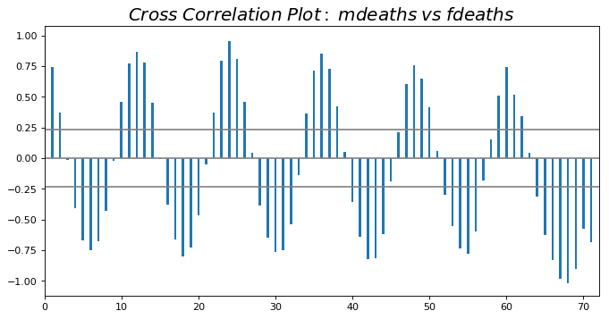
交叉相关图 (Cross Correlation plot)
|
|
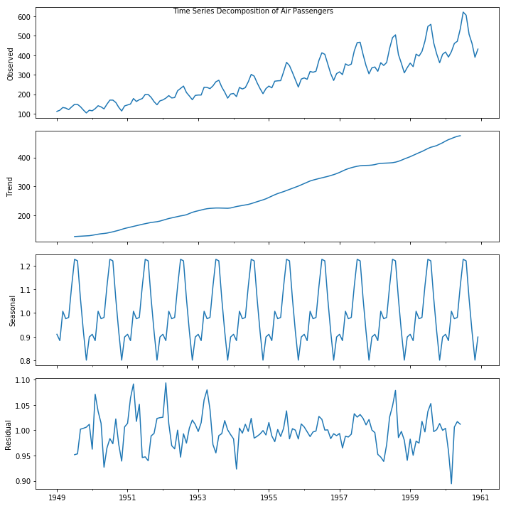
时间序列分解图 (Time Series Decomposition Plot)
|
|
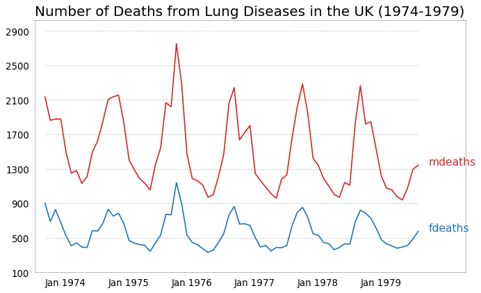
多个时间序列 (Multiple Time Series)
|
|
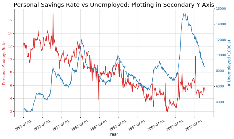
使用辅助 Y 轴来绘制不同范围的图形 (Plotting with different scales using secondary Y axis)
|
|
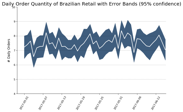
### 带有误差带的时间序列 (Time Series with Error Bands)
|
|

|
|
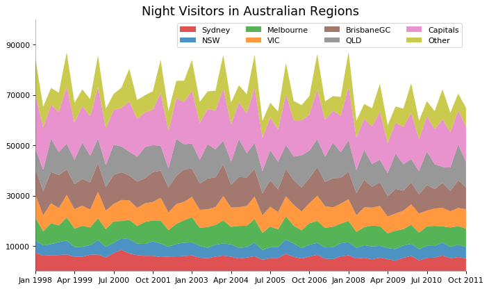
堆积面积图 (Stacked Area Chart)
|
|
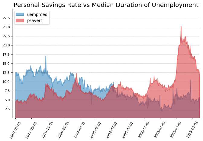
未堆积的面积图 (Area Chart UnStacked)
|
|
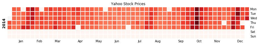
日历热力图 (Calendar Heat Map)
|
|
季节图 (Seasonal Plot)
|
|

分组 (Groups)
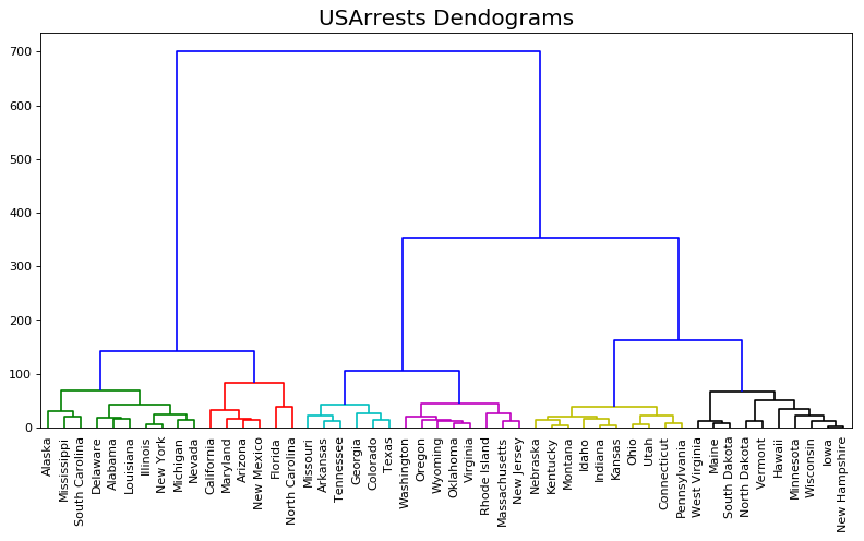
树状图 (Dendrogram)
|
|
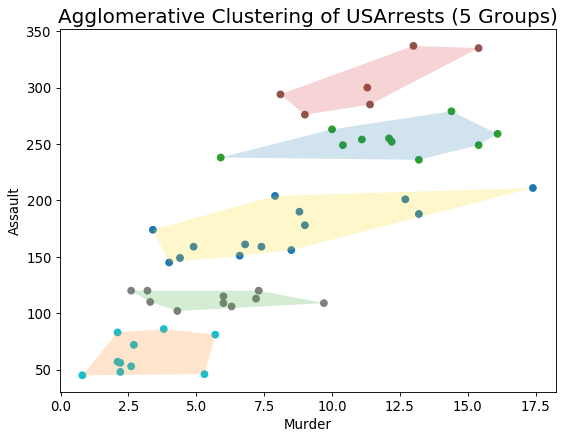
簇状图 (Cluster Plot)
|
|
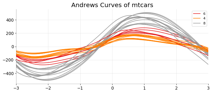
安德鲁斯曲线 (Andrews Curve)
|
|
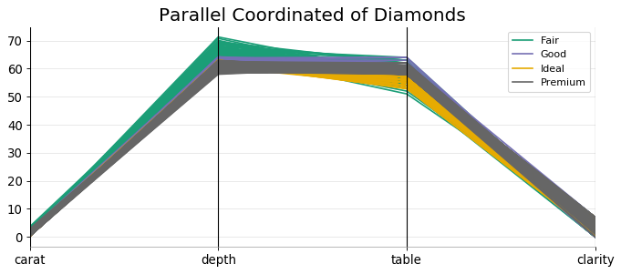
平行坐标 (Parallel Coordinates)
|
|
对原帖部分内容做了修改。
Author aice
LastMod 2019-04-25